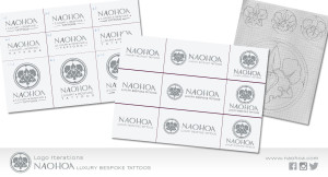
About two weeks ago, I started redesigning the logo because I wasn’t happy with how it was sitting/reading. The orchid motif is still the same, but I’ve made some subtle changes to ‘NAOHOA’ and changed the font/discarded embellishments on the strap line.
I thought it might be interesting for you guys to share the process of how the name and design came about. 🙂
Finding a Name
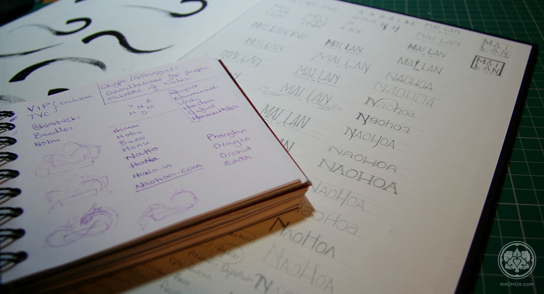
Wanting to develop a brand (rather than a tattoo shop with less wiggle room to expand), coming up with a name that could be used this way was tricky! For a long time, it was going to be called, “Mai Lan Ink” (Mai Lan being my Vietnamese name), but this would restrict me to tattoos and wasn’t very catchy. I wanted something that sounded soft, elegant and a little exotic.
After jotting down name ideas and variations based on letters from my name/locations I’ve lived in/symbolism (thanks for the inspiration, IKEA*), I then looked up the more favoured ones to check availability. Sure enough, they were pretty much all taken – or in Hona‘s case, reserved by Honda in case prospective clients misspelt their name. Argh.
Eventually, my partner at the time had a jolt of inspiration and said, “N-A-O-H-O-A”…..to which I exclaimed, “NAOHOA (‘naya-howa’)! Yes!” It’s my name (albeit pronounced differently. My surname is pronounced more like, ‘hwang’), it doesn’t exist as a word elsewhere, isn’t used by other corporations, it sounds exotic and has an air of mystery about it. NAOHOA. It sounds like a Hawaiian greeting…and I have a giant Maori-inspired tattoo on my back. Yes, that’ll do nicely, thank you.
Designing the Logo
 Wanting to keep the brand personal to me, I used an orchid for the main motif. My Vietnamese name is derived from the flower Phonglan, which is the dendrobium orchid. I’d already designed one for my previous company, so re-used it and switched it to grey instead of black. It looks like a Mon, which is pretty cool and keeps with the Asian theme.
The concept of NAOHOA and the studio was developed pretty quickly (within 3 months), so didn’t have time to reflect on the typography side of things until recently. I did have one or two friends point out that the original strap line didn’t sit well, but was in such a hurry to get things printed and ready to open business, I went with it anyway until I had time to re-do it. The advantage to doing all of this myself is that I’m not under pressure to pay thousands of pounds to settle on the right look straight away – I can update it whenever I see fit.
I made a few more iterations to the original logo, such as changing the font and kerning/adding or changing dividers/warping heights/darkening the first ‘A’ in NAOHOA to add weight…after some feedback from my UI Designer friends, I gradually designed and settled on this:

‘NOAHOA’ was a common typo and since I didn’t want to separate the two, I had to do something to make it read more easily. Hopefully, the darker ‘A’ will anchor it and additional spacing between NAO and HOA will help it read more clearly than before. I also added a thin stroke so there was less of a difference in thickness between the header and logo.
Comparison
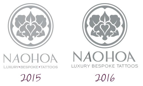
So there you have it! My journey in designing the logo. I hope you found it somewhat interesting. 😛
Naomi xxx
Footer
* Quote lifted from IKEA’s FAQ page:
The IKEA Group and business concept
When was IKEA founded and where does the name IKEA come from? IKEA was founded in 1943. The name is made up of the initials of our founder, Ingvar Kamprad and the first letters of the farm, Elmtaryd and the village Agunnaryd in southern Sweden where he grew up. Ingvar Kamprad was just 17 when he registered the IKEA name.
Brands Referenced:
- B E Z A N T London | Hand-crafted jewellery by Laura Bezant | www.laurabezant.com
- Shiseido | Japanese beauty brand | www.shiseido.co.uk
- Boodles | Bespoke, British luxury jeweller | www.boodles.com
- Swarovski | Austrian luxury crystals | www.swarovski.com
- Nobu | High-end Japanese fusion restaurants | www.noburestaurants.com
The designers of the fonts have been paid so that they can be used commercially.
Many thanks to Chris Williams and Sarah Ford for their feedback.
The old logo is still on all of my printed products and will be updated after they’ve been used up.

